Much like a hotel’s lobby serves as a strong first impression to its incoming guests, your website serves as an even stronger first impression to potential bookings. With major changes in Google’s search engine algorithm and the tourism industry’s rebound from the pandemic, designing a shiny, new, dynamic interface for your hotel website is more important than ever before.
7 Trends for Hotel Website Design in 2022
So whether you plan to attract new bookings or welcome returning guests in 2022, here’s a list of key ways to ensure that your online presence will make a lasting impression:
1. Dynamic Scrolling
If there’s one crucial web design tip we should start 2022 off with, simplicity is key. Dynamic scrolling features all of your important content on a single page. And if you’re guilty of having too much content or third-party apps on your hotel website, utilising a dynamic scroll with lazy loading will help solve most issues that can typically slow a site down.
It also allows for potential guests to visit your website from any type of device and sets you in the perfect position to work with Google’s newest demand of being mobile-friendly.
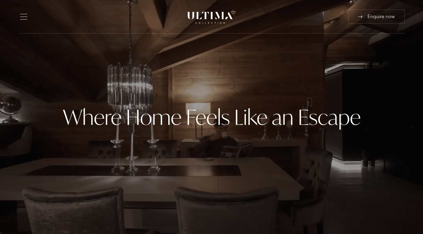
Ultima uses a hidden burger menu which creates a simplified website view.
Without any distracting menus or navigation, you have more control over how a user views your website. This is a perfect opportunity for storytelling as you have the chance to take them through your content and messaging more linearly. These website designs give a visitor the feeling of holding a flyer or reading a pamphlet.
After all, you wouldn’t hand a guest a 10-page booklet for them to decide to stay at your hotel, would you?
2. Mindful Design
The principles of mindful web design include an approach that avoids information or busy graphics that can potentially overwhelm a website visitor. As you can see, trends are moving back to a cleaner design with lots of white space (also known as negative space), making the visitor experience more relaxing and your content more easily digestible.
With a simplified layout and space to breathe, users can focus on the most important pieces of content and important CTAs, allowing for a smoother and faster conversion to book.
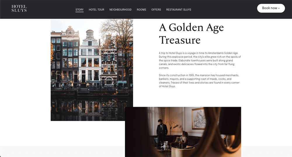
This eCommerce website template makes use of negative space.
Although the consideration of negative space has been a worldwide standard for quite some time, more web designers are now leaning towards the “dark mode” colour schemes. You may have already seen this trend on several social media channels and most mobile apps as it slowly becomes the norm. Dark mode designs can offer a more modern and vibrant alternative to traditional website colour templates.
Not only is it a fantastic way to highlight different content on your page by providing a strong contrast, but studies have even shown that there are several health benefits to utilising a dark theme during screen time, including minimising eye strain.
So, whether you choose to opt for the traditional “white space” background or dive into the “dark mode” trend, just remember that less is always more when it comes to all elements of your website.
3. Bold and Oversized Typography
Not only does bold and oversized typography create a striking first impression to your hotel website’s visitors, but it also condenses your primary messaging, leading to even faster conversions.
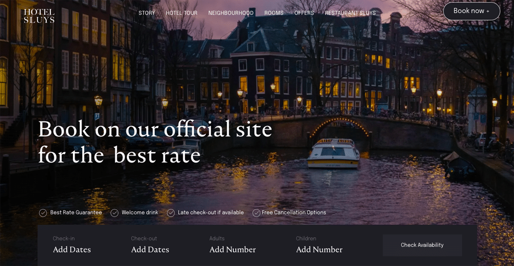
Bold typography is on show in this eCommerce website template.
When the text reaches a specific size, it becomes a graphic element rather than part of the copy. These elements can stand on their own or can even be paired with more minor, sub-copy. Fortunately, this approach can be adaptable to most website design styles and is a great way to tie different design elements together
4. Load Time and Page Speed
It’s no secret that the speed at which your hotel website loads is crucial to SEO and overall conversion. A recent study on landing pages found that websites with a 2.4 second load time resulted in double the conversion rate compared to sites that took 4.2 seconds. Essentially, if it takes more than three seconds to load your hotel website, users will quickly lose interest and leave to find another option.
Although this has been a priority of web designers throughout the years, the pressure from major search engines like Google and the competitive nature of tourism’s return will definitely motivate hotel website designers to find different ways to optimise for speed and ultimately offer lightning-fast loading times.
5. Gender-Neutral Design
Website design will always reflect the changes we are seeing happen in society. And with representation becoming the main concern for consumers these days, you may lose the interest of people that feel they are not represented in your marketing. Styles that promote gender inclusivity and reject gender stereotypes will not only widen your brand’s reach but position you as a hotel that takes the time to care for all of their guests’ concerns.
A major aspect of the gender neutrality trend is the rejection of pre-established stereotypical gender styles, especially when it comes to colour. Gender-neutral colours are typically muted, and minimalistic: greys, black, white, yellow, green, orange, light browns, and muted tones in general.
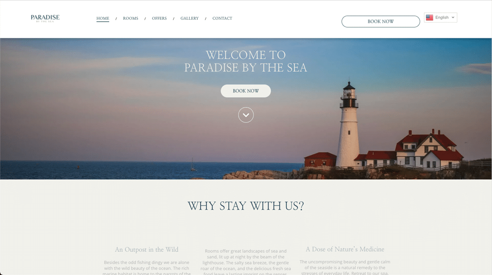
ELIVI HOTELS uses minimalistic colours on its website, which creates a gender-neutral design.
Additionally, choosing gender-inclusive typography, imagery, language, and even iconography can significantly impact how visitors view your brand. Sticking to classical web fonts, making sure that your marketing images are inclusive, and using gender-neutral pronouns will create a sense of connection for your hotel website’s visitors, leading to higher conversion.
6. Inclusive Language
It’s apparent that accessibility is becoming more of a necessity than just a passing trend. Inclusive language considers all aspects of diversity including, but not limited to ability, gender, language, race, and socioeconomic status. You should be implementing this type of language in your forms, product marketing pages, and any interaction within the customer experience.
Is your website’s text easy to read for everyone? Are you implementing alt text in your imagery? Do you use language that visitors would easily understand? Is your language sensitive to the needs of people from different backgrounds?
Ensuring that every type of visitor will use your website with ease goes above and beyond excellent customer service. It shows them that their needs and desires are at the top of their mind, and you are accommodating them in your website’s design.
7. No-code Tools
The rapid rise of no-code resources and tools, such as Hotelchamp eCommerce, has caused a significant shift in the tech industry. Gone are the days where you had to find a software developer to build and alter your website. This change allows people of all experience levels to build and design without waiting for a software expert to make those changes for you.
For hotel brands, this opens up the ability to create a more efficient workflow with a higher efficiency rate, saving time and money. And with no-code tools utilising cloud storage and drag and drop features, it’s no surprise that marketers across industries are taking advantage of this technology to collaborate across teams in real-time.
The online audience of 2022 will expect clean, clear, and intuitive web browsing. Stunning imagery and transparent messaging will keep returning guests intrigued while also attracting new bookings. Which of these trends will you be implementing to your 2022 design plans?
More Tips to Grow Your Business
Revfine.com is the leading knowledge platform for the hospitality and travel industry. Professionals use our insights, strategies, and actionable tips to get inspired, optimize revenue, innovate processes, and improve customer experience.Explore expert advice on management, marketing, revenue management, operations, software, and technology in our dedicated Hotel, Hospitality, and Travel & Tourism categories.


Thank you for creating such valuable content. Your hard work and dedication are appreciated.
Nice examples of beautifully designed hotels!
Thank you for the inspiration.