The hospitality industry has strong competition and the rivalry for guests is going to be even more fierce these days. Hotels compete online for guests not only with other hotels but with other players, such as OTAs and Search Engines Hotel Markets. Therefore, hotels should ensure that their website attracts customers. In this article, you’ll find the 20 most common “deadly” mistakes that kill your website’s conversion rate and you can learn how to turn them into conversion rate winners!
What Makes a High Converting Hotel Website?
It is important to follow five basic principles of Conversion Rate Optimization when improving your hotel’s website conversion. The hotel website should be: Functional, Accessible for different guests and devices, Usable, Intuitive, and, on top of that, be Persuasive to motivate guests to finish their booking. Yes, these are general directions, not yet a detailed roadmap. To have an action plan it is easier to check your website for critical errors we have listed for you below and remove all the obstacles that block your direct bookings.
What are Conversion Killers?
Here is the list of the most common mistakes you’d better avoid in order to have more direct bookings:
1. Slow Loading Time
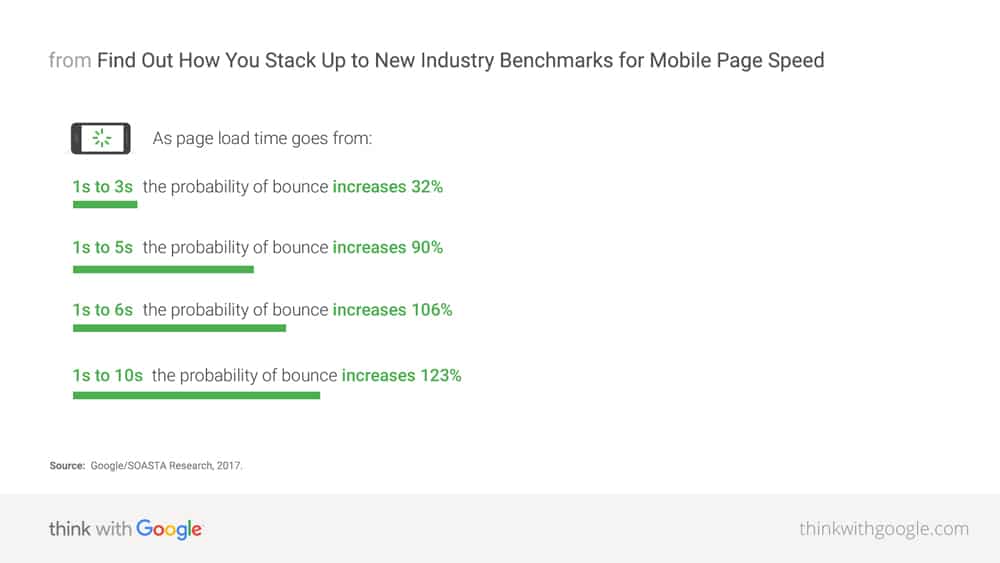
Website speed isn’t only a ranking factor for your SEO but also a huge boost for direct sales. Every second of delay increases the bounce rate and decreases visitors’ satisfaction, and therefore your conversion.
“So we have hypothetical data and practical data so we don’t really have a threshold to give away but basically the recommendation I would say is just make sites fast for users, that’s what it boils down to.” Martin Splitt, Google, 2019
Even though Google doesn’t give a specific number, you can benchmark with Booking.com – it takes 4 seconds for the website to be interactive. To win the conversion game, your website, desktop, and the mobile version should load faster than 4-5 seconds.
There are plenty of free tools that can help you check your website’s speed and provide you with tips on what to improve. Start with Page Speed Insights by Google or choose Pingdom, GTmetrix, or WebPageTest.
2. Unclear Call to Action (CTA)
The book button should be the most attractive and visible element on every page. The CTA should be visible at all times, including when the user scrolls and leaves the homepage. Use clear and compelling copywriting, action verbs, and verbs referring to the desired action: Book or Sign In instead of Search or Add email. Make sure that various CTAs are not conflicting with each other on the same page.
3. Poorly Made Offers
Good offers increase the value of your website, bad offers leave more questions and result in the user being perplexed. Here are some critical don’ts:
- Don’t duplicate promotions from OTAs – if they are not unique, they don’t encourage loyalty;
- Don’t overload the user with too many options – so don’t make it hard to choose;
- Don’t forget the CTA – applying for an offer shouldn’t be confusing;
- Don’t make it hard to book. For example, by adding a complicated Reward Program Sign In;
- Make offers consistent and logical, not contradicting with each other;
- Don’t forget to update the website regularly and delete inactive offers.
4. Website Not Being Responsive and Not Optimized for Mobile
Guests are checking your mobile website: more than a third of all bookings come from mobile devices and more than half use multiple devices (mobile, tablet, desktop). These numbers are growing. Be sure to have a seamless mobile process and mobile-first booking engine, don’t scare your guests away!
5. Bad Design: No Style Guide
Obsolete, cluttered, inconsistencies on a website page repel guests. Your design should reflect your hotel’s style, target audience, and be aligned with your marketing strategy. For example, if the hotel has been renovated and you want to promote the modern new rooms, an old-school webpage design doesn’t transmit the right message.
6. Confusing Navigation and Menu
Do you know why guests visit your hotel website? To find information about the rooms and promotions and to make a booking. Be sure your main menu serves that purpose.
- The header should contain information that users need. For example, we’re hiring can be placed in the footer;
- Avoid placing too many items on the menu – don’t hide the important sections;
- Choose a standard, horizontal design and put it in the standard place (top of the page) – so users won’t spend any extra seconds looking for it;
- Make it descriptive: About Hotel instead of About us, Conference Hall or Restaurant instead of Services;
- Use links, not buttons. Buttons load slower, it’s harder to adapt them to mobile. They decrease your website speed and they are not SEO friendly.
7. Low-Quality Visuals
Images and videos are the only way your visitors can ‘feel’ your hotel. If your leading image is bad, you probably won’t have a chance to make a second impression.
Try to avoid the bad quality visuals, unappealing images or video, and irrelevant visuals targeting wrong audiences.
8. Generalized Marking Strategies
As well as for visuals, the content should be target-specific. Know your audience, focus on identifying guest personas, and adapt your website accordingly. There´s quite a difference between selling to families compared to business travellers!
9. Poor Language Use
Check and recheck your website for mistakes, typos, and bad translations. Especially translations! It is better to have fewer language versions made properly than too many versions that you can’t update and ensure the quality of the translations.
10. Too Much Information
Don’t overwhelm guests with too much text, but keep balance by providing all necessary information (rates, conditions, rooms description, etc). Be consistent with the style of writing throughout website pages, social media, and other communication platforms. Know the message you want to share and find proper wording.
11. Disparity!
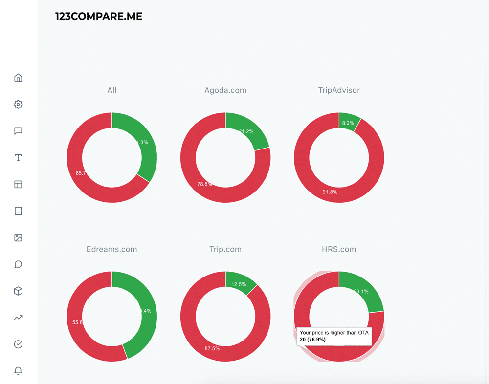
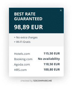
Your digital sales strategy should always be focused on the Best Rate Guarantee principle. Good channel managers and OTAs’ control tools (disparity alert) can help you to ensure OTAs don’t undercut your price.
To automate control of online travel agencies, use Price matching. For example, Rate The comparison widget by 123COMPARE.ME automatically offers a discount in case a disparity with the OTA was detected.
12. No Direct Booking Benefits
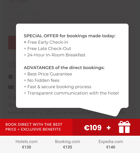
To win over OTA’s it isn’t enough to have the same or a lower price. Your proposal should be better and offer extra value for the same price. Explain what perks the guest gets when booking direct. Clearly highlight the unique selling points with the blog post and widget.
13. Bad Booking Funnel
The fewer clicks the guest needs to book – the better! Try to configure your booking engine to have no more than 3 steps (search – choose the room – check out) and avoid requesting an excess of personal data that is time-consuming to fill in.
Make it easy to sign in for the Loyalty Program or adding extra services, without interrupting the booking process. Don’t forget to have a “Send My Search” widget.
14. No Cart Recovery or Email Remarketing
Guests can drop the booking process for various reasons – they can be distracted, lose the internet connection, or experience electricity cut-off or just close the tab by mistake. It doesn’t matter. If you don’t try to prevent cart abandonment and don’t reconnect with the guest who didn’t finish the booking process, you lose revenue. Email remarketing truly saves your bookings!
15. Not Making Use Of Empty Search Results
If your hotel doesn’t have a room available for a specific date or the hotel was not open because of the season – don’t leave the guest wondering. Show open dates or, at least, offer to sign in for “waiting list”.
You can provide relevant news or information on this page or share a link to a blog post on social media. Anything to encourage guests to stay with the website and continue the booking process!
16. A Lack of Proof
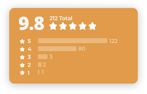
Travellers reviews have a huge impact on users’ behaviour and increase conversion. Guests will hesitate to book with the hotel without seeing other guests’ opinions.
17. No Communication With the Hotel
Guests need a way to contact the hotel when they need it. Lack of a visible phone number or email address scares visitors. The absence of online customer support, such as Live Chat or Call Back buttons, lowers the conversion rate. Be sure you are there for your guests as soon as the question arises in their head.
18. Website is Not Updated
Informing your potential guests what is going on with the hotel was never that important, as during pandemic and post-pandemic times. It is crucial to check if all the descriptions and offers are up to date. Share news and actual status, show that the website is alive! Otherwise, guests might think that the hotel had been closed and the management just forgot to update online status.
19. Lack of Trust Elements
Trust is the foundation for conversion. If the guests don’t trust you, why would they book and send money to you? Be sure your website is secure on every page. This includes images and other elements you embed within your webpages:
- Switch to secure protocol (https) and don’t let it expire;
- Don’t ask for unnecessary personal details;
- Explain how you manage personal data, including storing bank card details;
- Update Privacy, GDPR, and Cookies policies;
- Display the right Trust Seals on the payment page.
20. Ignoring A/B Testing
The last but not least, whatever improvements you want to implement, don’t forget to check how it affects the conversion on your website. Conversion rate optimisation works differently for different hotels. It depends on the hotel’s location, type, targeted guest, average rate, and many other parameters. There is no ideal solution for everybody. Try different options (colours, layouts, CTA and copywriting, etc.) to see what works best for your hotel.
This list can be used as an action plan – go through it step by step and ensure your website rocks! You can get a conversion boost only by fixing these errors. If you want to become a conversion leader, you’ll need to go deeper. In-depth analysis and detailed action will require work from you, yet it could bring you to the next level of conversion success.
More Tips to Grow Your Business
Revfine.com is the leading knowledge platform for the hospitality and travel industry. Professionals use our insights, strategies, and actionable tips to get inspired, optimize revenue, innovate processes, and improve customer experience.Explore expert advice on management, marketing, revenue management, operations, software, and technology in our dedicated Hotel, Hospitality, and Travel & Tourism categories.





Leave A Comment